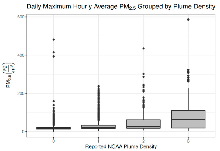
Figure 2.
Box plot comparing ground-level PM2.5 concentrations and smoke plume density categories for each day in the entire 2017–2018 California wildfire seasons. The thick line within each box represents the median value, and the top and bottom of each box represent the 75th and 25th percentiles, respectively. The whiskers end at the value within the data that is no more than 1.5 times the interquartile range away from the edge of the box, and the dots beyond these whiskers are outliers.

