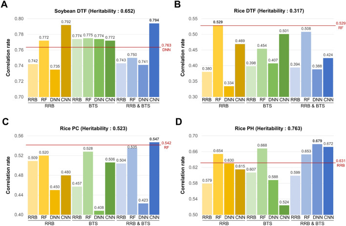
Figure 4.
Correlation rates of test sets for four phenotypes, along with selection methods and prediction models. (A) Correlation rate of soybean DTF. (B–D) Correlation rates of rice DTF, PC, and PH. The y-axis indicates the correlation rate, and above and below the x-axis represents the selection methods and prediction models, respectively. The highest correlation rates for each phenotype are shown in bold, and the highest correlation rates when using all markers are indicated by a horizontal red line with that prediction model.

