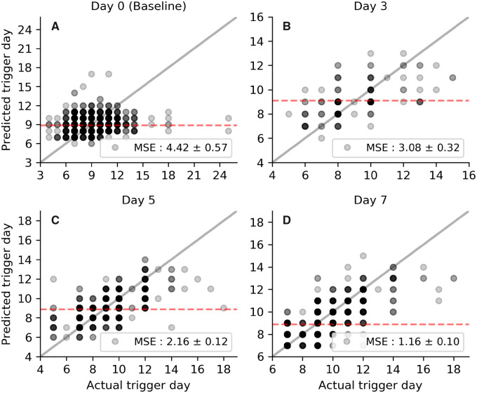
Figure 4.
Evaluation of model performance for respective scan days. Each panel represents a single scan day (see panel titles) and each data point is an individual patient’s predicted (vertical axis) and actual (horizontal axis) trigger day. Data points are translucent, so darker shades represent a higher density of points. The solid grey line shows the performance of a perfect predictor and the red-dashed line the mean trigger day for patients scanned on the respective day. n= 2128 cycles

