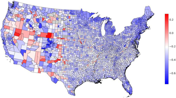
Figure 1: Heterogeneity in mobility during social distancing.
Map shows average mobility during COVID-19 social distancing at the county level in the (continental) United States, relative to the pre-COVID-19 baseline. A positive value indicates an increase in distance traveled, and a negative value a decrease in distance traveled. Counties for which the data is not available are shown in grey. We note that the colormap is centered at the 90% percentile of the decrease in mobility.

