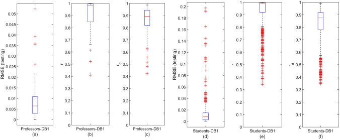
Figure 4.
Distribution of the DeepLMS predictive performance indices across users’ groups of DB1. (a) Box-plot of the distribution of RMSE between the testing and the estimated QoI data for the case of DB1 Professors, (b) box-plot of the distribution of the correlation coefficient r between the testing and the estimated QoI data for the case of DB1 Professors, (c) box-plot of the distribution of the correlation coefficient between the derivative of the testing and the derivative of the estimated QoI data for the case of DB1 Professors; (d-f) same as (a–c), respectively, yet for the case of DB1 Students. Each box-plot visualises the interquartile range (height of rectangle), spanning the first (bottom) to the third quartile (top), the median value (horizontal red line inside the rectangle), the minimum and maximum values (ends of “whiskers” below and above the box, respectively) still within the interquartile range, and outlier values (individual red crosses below and above “whiskers”). Additional DeepLMS predictive performance indices are tabulated in Table 1.

