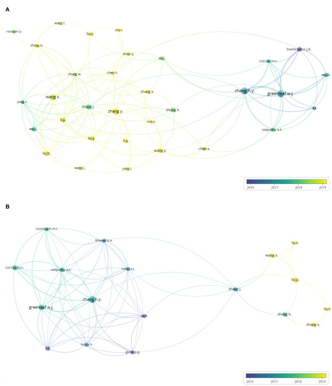
Figure 5.
Author co-authorship overlay visualization map. The last names of the authors are listed. The size of each circle indicates the number of articles published by the author. The distance between any two circles indicates the relatedness of their co-authorship link, and the thickness of the connecting line indicates the strength of the link. The color of each circle indicates the average publication year of the author, according to the color gradient in the lower right corner. (A) Author co-authorship overlay visualization map of the 384 ATAC-seq-related articles. (B) Author co-authorship overlay visualization map of 58 ATAC-seq-related articles on cancer biology.

