
Figure 4. J‐point amplitudes and ST‐segment elevation location.
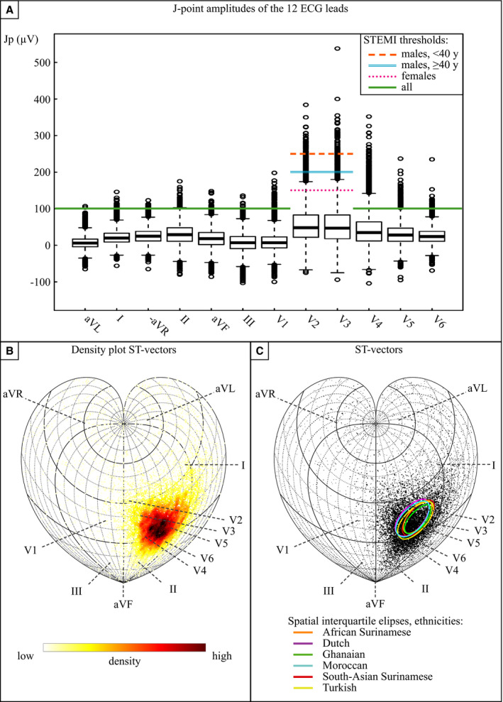
A, The colored lines represent the current age‐ and sex‐specific STEMI thresholds for each lead. Black stripes box: Q1, Q2, Q3, whiskers: Q1–1.5·interquartile range and Q3+1.5·interquartile range. Boxplots of the J‐point amplitudes in the total apparently healthy population (N=10 783). Appreciate the amount of J‐point amplitudes above the STEMI threshold in leads V2, V3, and V4. (B and C) general: The directions of the 3‐dimentional ST vectors of all subjects are shown on a sphere in the 2‐dimensional plane by cordiform Stab‐Werner projections. Lead vector projections are marked with dashed lines. B, Density plot. Note the precordial orientation of most ST vectors. C, ST vector of all subjects in which the marker size represents the size of the ST vector. Interquartile ellipses of a combination of azimuth and elevation are stratified per ethnicity. Because the direction of small ST vectors is rather unreliable, small markers with a deviant direction should, in our opinion, not be seen as actual outliers. No evident ethnic difference in spatial ST vector distribution can be appreciated. Jp indicates J‐point; STEMI, ST‐segment–elevation myocardial infarction; and y, years old.