
FIGURE 4.
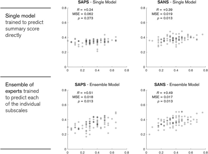
Plots of model predictions and true scores for the SAPS (left) and SANS (right) summary scores. Top row shows the predictions for a single model trained to predict the summary scores directly. Bottom row shows predictions for an ensemble model, where each expert is trained to predict one of the individual subscales. Predictions for each subject are shown as grey dots. All scores are rescaled to a zero to one scale. p‐values are Bonferroni corrected for multiple comparisons