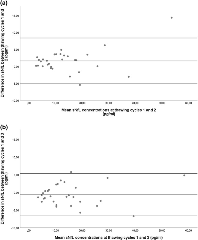
Figure 2.
Differences in sNfL concentrations after a different number of thawing cycles. Bland–Altman plot showing the differences in sNfL concentration between two groups of thawing cycles. (a) One versus two thawing cycles. (b) One vs. three thawing cycles. Single dots represent samples at two conditions with their mean concentrations on the x-axis and their difference in concentration on the y-axis. The three horizontal lines represent the mean difference (middle) and the mean difference plus 1.96xSD of that difference (upper) and mean difference minus 1.96xSD of that difference (lower).

