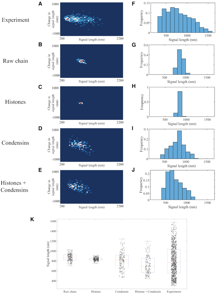
Figure 1.
Signal length analyses of experimental and simulated plasmid signals. Density heatmaps (A–E) of plasmid signal lengths versus change in plasmid signal length per time interval (30 s) and histograms (F–J) of plasmid signal length for experimental data; simulated data with only polymeric DNA; simulated data with DNA and histones; simulated data with DNA and six condensin complexes; and simulated data with DNA, histones and six condensin complexes, respectively. Data for each simulation figure are for a total of 183 time lapses selected from three independent simulations. Time lapses are chosen only after the equilibrium state has been reached. Data for experimental samples are from a total of 925 observations. (K) Signal length box plot versus distinct classes of proteins in the simulation. The red lines represent median, the blue boxes show 25 and 75 percent quantiles, and the whiskers extend to the most extreme data points not considered as outliers. Each dot represents one data point.

