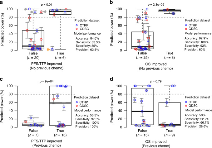
Fig. 4. Clinical trial validation results show accurate efficacy predictions for trials in previously untreated patients but not for trials in previously treated patients.
IDACombo was used to make efficacy predictions for the control and experimental treatments of the clinical trials selected using the pipeline in Fig. 3. Hazard ratios were then calculated using these predictions, and study powers were calculated for each available comparison of a control therapy vs. an experimental therapy. These comparisons are separated based on whether or not the experimental arm statistically improved either PFS/TTP (panels a and c) or OS (panels b and d) in the published trial results. Predicted powers for each comparison are plotted on the y-axes, and an 80% power threshold (dashed line) is used to classify whether or not a comparison is expected to yield a statistically significant improvement. Comparisons are colored according to the dataset used to make predictions for the compared treatments. Panels a and b show results for trials in which patients had received no previous drug treatments. Panels c and d show results for trials in patients who had received previous treatment. Error bars for each plotted clinical trial power represent mean estimated power ± standard error (bounded between 0% and 100% power). Gray and orange arrows in Panel a indicate misclassified trials that are discussed in the text. P values were calculated using one-tailed t-tests. Blue circles indicate predictions made using the CTRP dataset, and red circles indicate predictions made using the GDSC dataset. Boxplots are plotted so that the lower and upper whiskers indicate the extreme lower and upper values, respectively, the box boundaries indicate the first and third quartiles, and the center line indicates the median. Source data are provided as a Source Data file.

