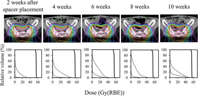
Fig. 5.

Dose distributions for proton beam therapy (top) and corresponding dose volume histograms (bottom) at different phases, from the development of a treatment plan (left) to the treatment end (right). The dose distributions were normalized using the prescribed dose. The graphs show radiation doses to the planning target volume (thick line), large bowel (dotted line) and rectum (thin line).
