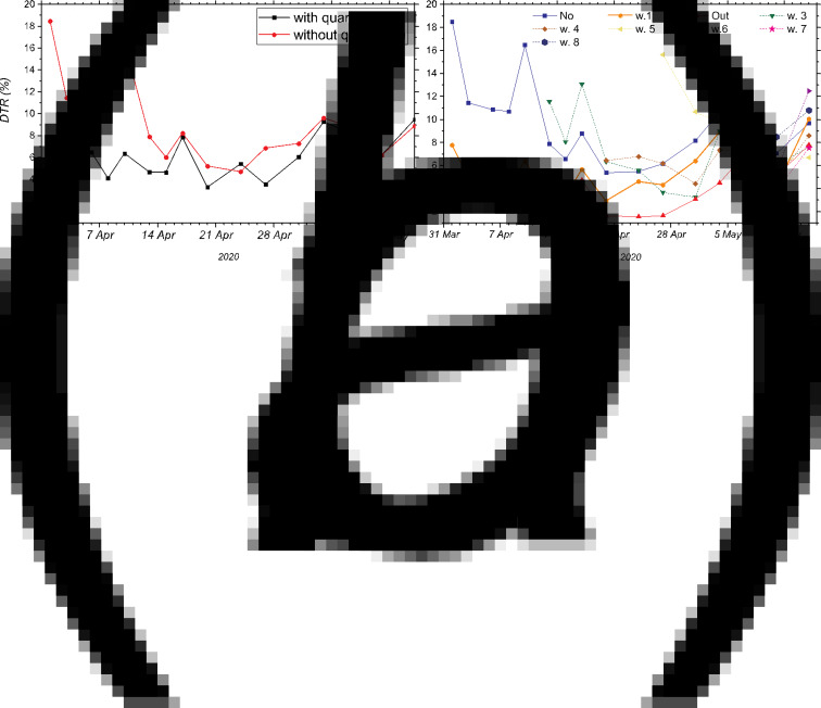
Fig. 4.
Percentage increase in the DTR as a function of time in the MR from 30 March until 15 May. (a) Communes with quarantine (squares) and without quarantine (circles). (b) Segregation into dynamic quarantines: communes that did not enter quarantine are represented by squares (No). Communes that entered quarantine during the first week of quarantine measures and remained under quarantine are represented by circles (w.1). Communes where quarantine was lifted are represented by the top-pointing triangles (Out). Communes that entered quarantine in weeks 3, 4, 5, 6, 7 and 8 are represented by different markers (abbreviated w.3, w.4, w.5, w.6, w.7 and w.8, respectively).

