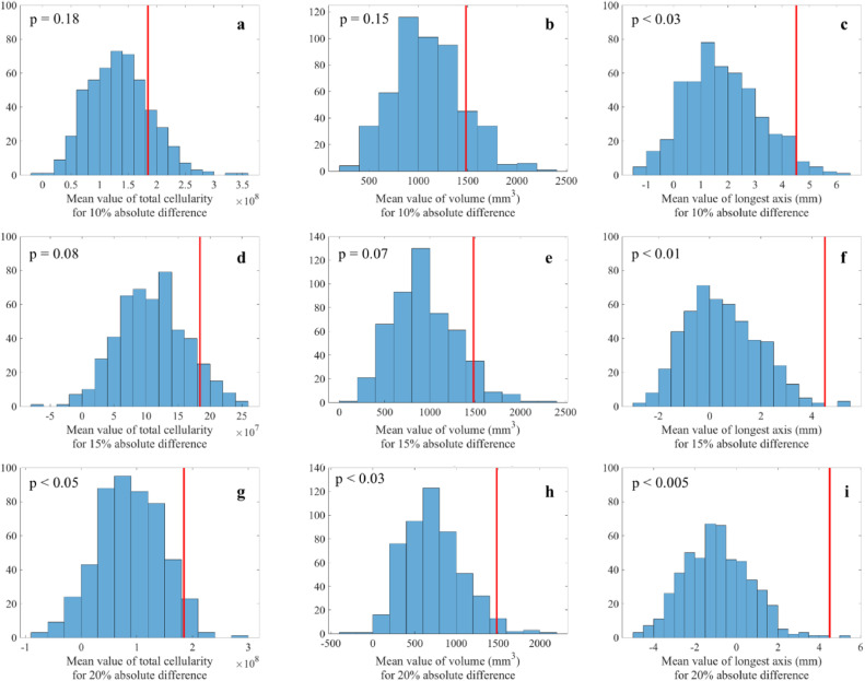
Figure 3.
Distributions of sample averages between predicted and measured outcomes (i.e., total cellularity, volume, and longest axis) generated with a Monte Carlo resampling (N = 500 for each distribution) across the patient cohort. (See Supplemental Material for details on the construction of these plots.) Each panel depicts the distribution of the randomly sampled differences between each predicted and measured outcome. The red vertical lines indicate the mean difference for the cohort. (Note that the red lines do not represent mean of the sampled distributions and, therefore, are not in the center of the distributions.) For example, panel a presents the sample mean differences between the predicted and measured total cellularity assuming a 10% absolute difference between predicted and measured total cellularity. Panels b and c display similar data for volume and longest dimension, respectively. Panels d–f correspond to panels a–c, but assuming a 15% absolute difference between predicted and measured total cellularity, volume, and longest axis, respectively. Panels g-i also correspond to panels a–c but assume a 20% absolute difference between predicted and measured total cellularity, volume, and longest axis, respectively.

