
Figure 2.
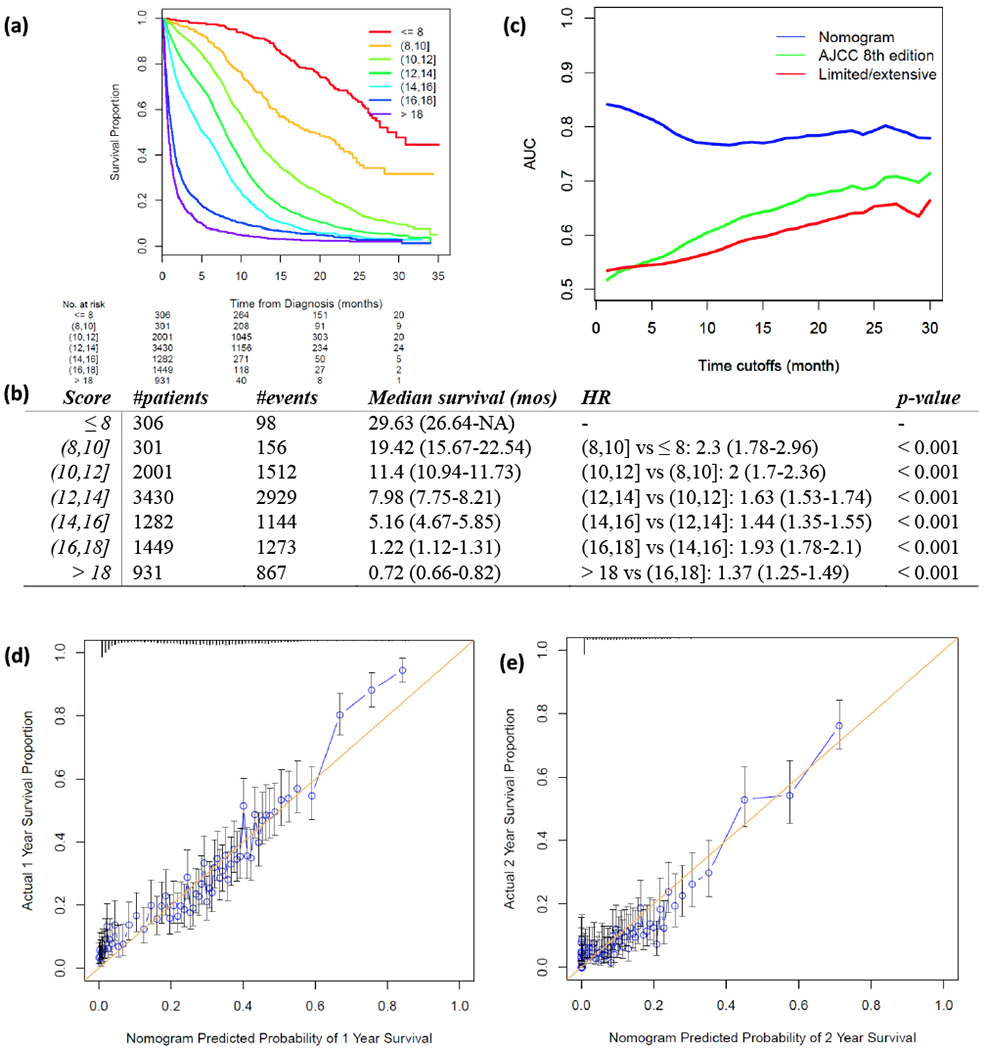
Validation of proposed nomogram prognostic model in the testing set. (a) Risk scores of testing set cases were calculated according to the model in Figure 1 and grouped into 8 subgroups. K-M plot was depicted for each group. (b) Summary of groups in (a). Hazard Ratio (HR) was calculated using Coxph regression model between each two adjacent lines. P-value was calculated using Wald test. (c) Area under the curve (AUC) was calculated for three prognostic models for every month from the 1st to the 30th month. Blue: nomogram developed in this study; green: AJCC 8th TNM staging system; red: limited/extensive staging system. (d, e) Calibration curves compare predicted and actual survival proportions at 1 year (d) and 2 years (e), separately. Each point in the plot refers to a group of patients, with the nomogram predicted probability of survival shown on x-axis and actual survival proportion shown on y-axis. Distributions of predicted survival probabilities are plotted at the top. Error bars represent 95% confidence intervals.