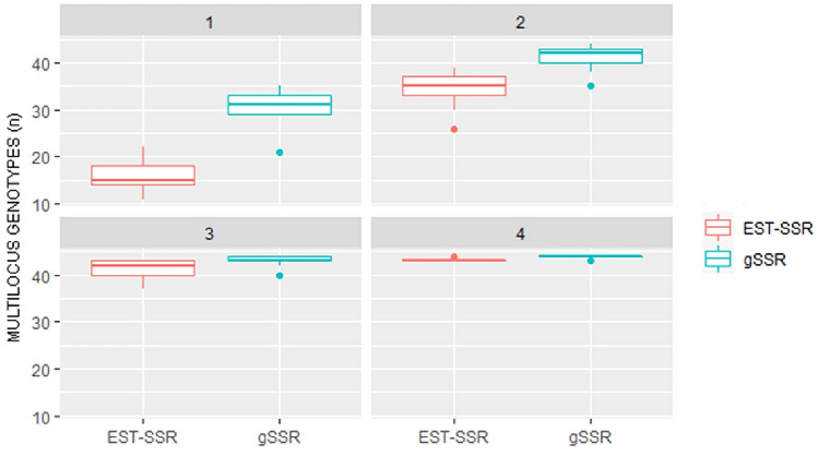
Fig. 1.
Genotype accumulation plot. The graph shows in different panels (representing increasing number of SSR loci as indicated in the top dark grey bar), a box-and-whisker plot of the number of multilocus genotypes obtained by randomly sampling loci without replacement (n = 10,000). The band inside the box represents the median (2nd quartile). Dots indicate outliers (i.e., values outside 1.5 times the interquartile range above the upper and below the lower quartile). EST-SSRs (resp., gSSRs) box-and-whisker plots are in salmon (resp., turquoise) colour

