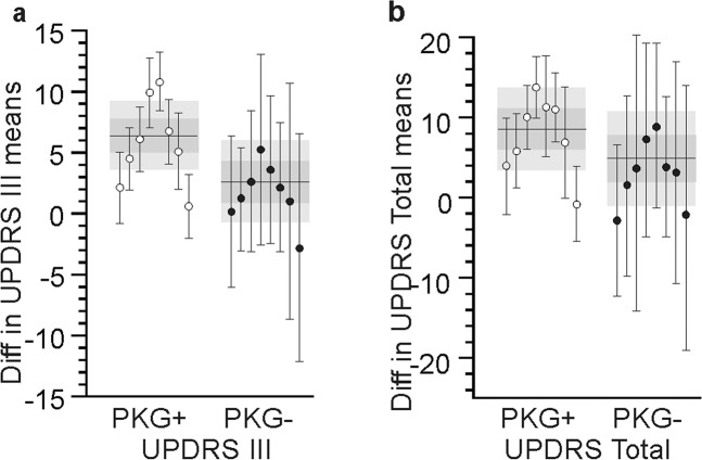
Fig. 4. Change in MDS-UPDRS produced by each doctor.
Panels a, b show the difference between the means (of the 1st and last visit) of the MDS-UPDRS III (a) and MDS-UPDRS total (b) for each doctor (each dot is a doctor and the bar is the SEM). White dots represent PKG+ doctors and black dots indicate PKG− doctors. The grey bands indicate the 95% CI of the whole population (PKG+ and PKG− respectively) with the horizontal line indicating the mean and the darker grey the IQR. Note that the 95% CI and SEM are smaller in the PKG+ arms.

