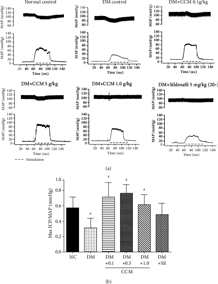
Figure 2.

(a) Representative ICP and MAP tracings at 5 voltages in the six groups. (b) Bar graph depicting Max ICP/MAP ratio. Values represent mean ± SD(N = 10). ∗P < 0.05 compared with the normal control group, #P < 0.05 compared with the DM control group.
