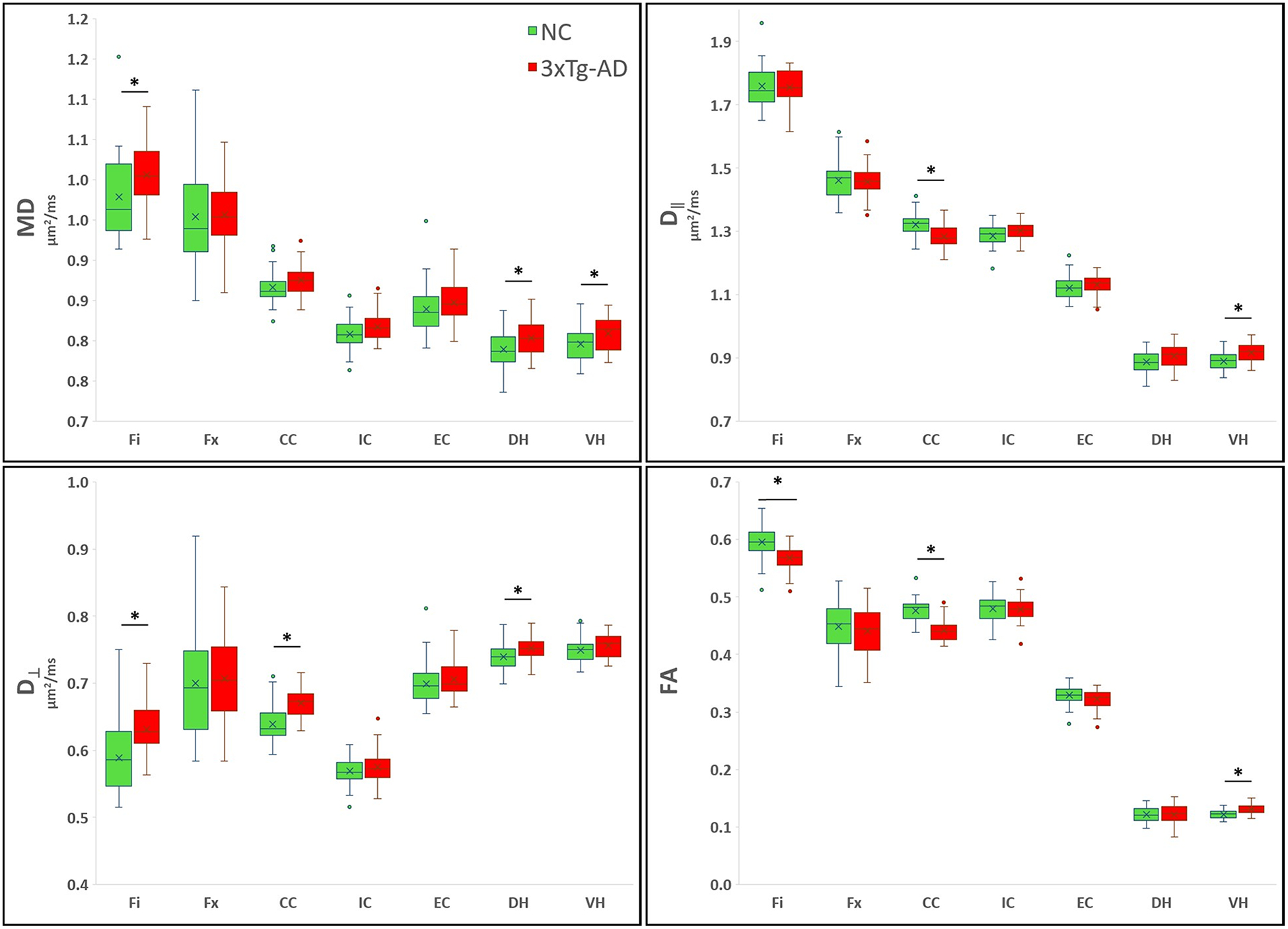
Figure 4 -.

Boxplots showing the averaged DT metrics. On the boxplots, data are presented as medians (line), mean (x), quantile (box, 25–75% of data range), range (whiskers); outliers are depicted with ovals dots. *indicates significant values for group comparison after Bonferroni correction (8 dMRI comparisons).
