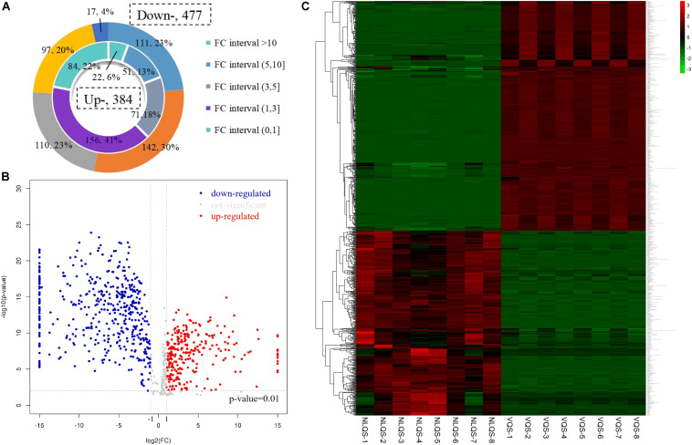
FIGURE 2.
Fold change (FC) arrangement and pattern of metabolites that were different in NLQS compared with those in VQS in the honeybee Apis mellifera. (A) The inner circle indicates high concentration metabolites, and the outer circle indicates low concentration metabolites in NLQS compared with those in VQS. (B) Volcano plot of metabolites that were different in NLQS compared with those in VQS. Each dot represents an individual metabolite: red indicates high concentration, blue indicates low concentration, and gray indicates no change. (C) Pattern heat map. The color code from green to red indicates the abundance of metabolites from low to high, respectively.

