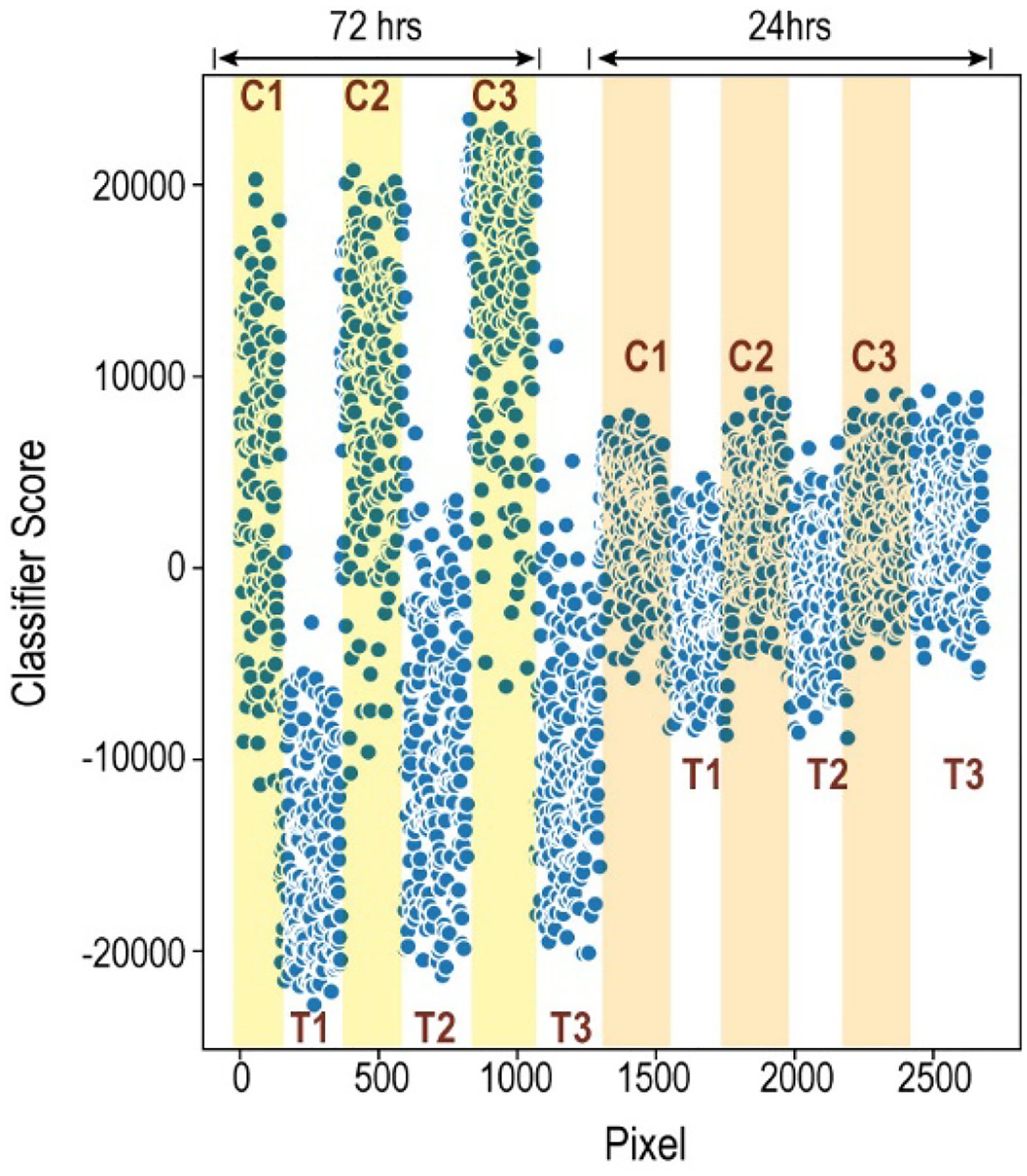
Figure 4:

Comparison of the results for the supervised classification at 24 and 72 hours. Each point represents the classifier score for a pixel from one of the spheroids. The plot does not maintain the spatial arrangement of the pixels; rather, the Y dimension is Classifier Score. The X dimension, Pixel, contains the pixels from each spheroid as they were represented in the original data matrices. Pixels from controls are shaded (72 hrs: yellow; 24 hrs: orange.) Pixels from treated samples are unshaded. The increased separation of the treated vs control groups, and the larger signal magnitude for the 72-hour data set, indicates that the global metabolic profile between the treated and untreated spheroids is more pronounced at 72 hours than at 24 hours.
