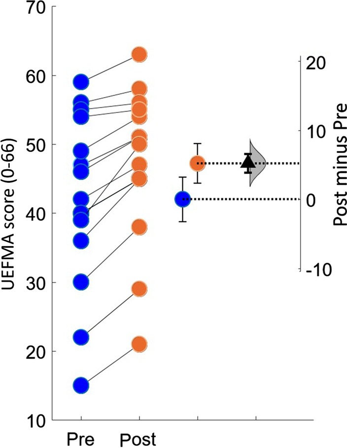
Fig. 4.

Estimation plots of Fugl-Meyer Assessment. The small circles represent the individual subjects. The blue and orange circles with error bars represent group mean of pre and post UEFMA with their 95% confidence. This is depicted on the axis on the left. The difference between the group means is depicted on the “difference axis” on the right. The 0 point of this axis is based on the group mean of pre UEFMA test. The filled triangle shows the difference between pre and post UEFMA scores. The shaded curve shows the entire distribution of expected sampling error for the difference between the means
