
Figure 3.
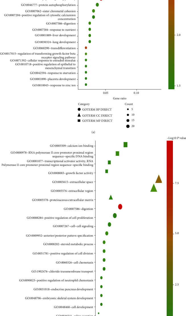
Bubble plot for GO enrichment of DEGs in (a) normal vs. Hp-GA and (b) Hp-GA vs. Hp-GC. The gene ratio is assigned to the x-axis and the description of pathway to the y-axis. The area of the displayed graphic is proportional to the number of genes assigned to the term, and the color corresponds to the adjusted P value.