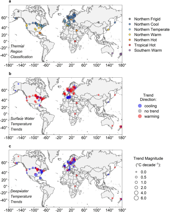
Figure 1.
Map of the 102 lakes included in this analysis. Panels indicate (a) the thermal region classification for all lakes, and trends for (b) surface water temperature and (c) deepwater temperature. Panels (b,c) have a common legend, where point colour represents trend direction (red = warming, blue = cooling), and point size represents trend magnitude. Regions with high densities of lakes have had their exact latitude and longitude slightly shifted for visual clarity. Maps were generated in R version 3.5.088, and with world map data from the “ggplot2” R package89.

