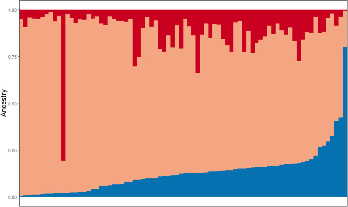
Figure 2.
Representation of ancestral admixture in Latino cohort. Subjects are sorted on the X-axis based on percentage of Amerindian ancestry contribution (0–80%, displayed in blue). Colors in each vertical line represent that individual's ancestral admixture. Red = African, Orange = European, Blue = Amerindian.

