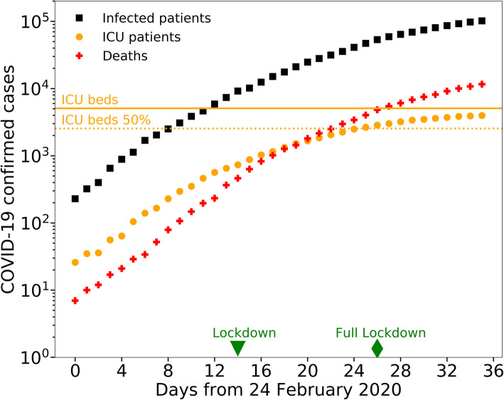
Fig. 2.
Time evolution of COVID-19 epidemic in Italy. The number of infected patients (black squares) and deaths (red crosses) increased exponentially in time (note that the vertical axis has exponential units). The number of intensive care patients (orange circles) grew exponentially until it reached the maximum capacity of the NHS, and then slowed down as the ICU beds saturated in the Italian regions of Lombardy, Piedmont, Marche, Trentino Alto Adige, Valle d’Aosta, which host 28% of the Italian population. The green triangle and diamond represent the lockdown day (March 9th 2020) and full lockdown day (March 21st 2020) respectively. The orange solid line and dotted line represent 100 and 50% of the total number of ICU beds in Italy before the onset of the epidemic, which was equal to 5090 [7]

