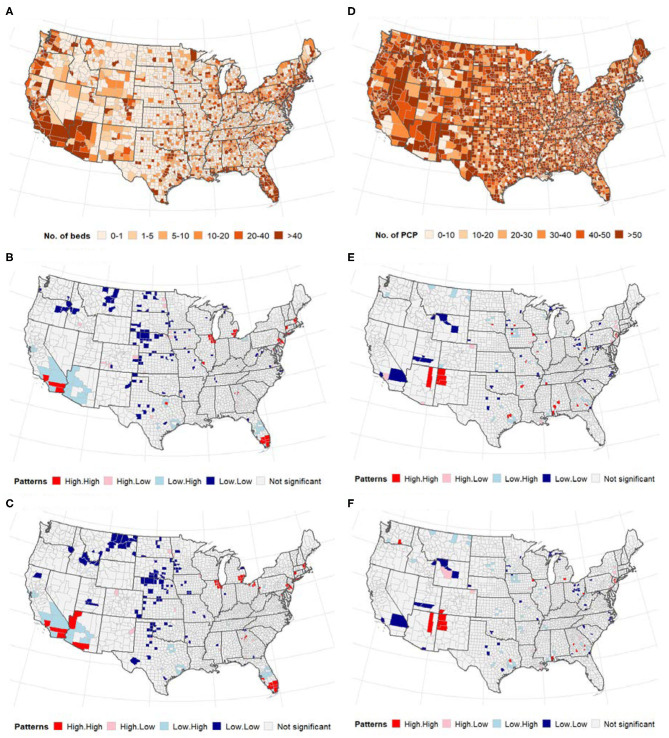
Figure 2.
(Top) Distribution of the number of ICU beds (A) and PCPs (D) across US counties; (middle and bottom) Bivariate LISA map between ICU beds/PCPs and COVID-19. (A–C) ICU beds, (D–F) PCPs. The high-high and low-low areas represent spatial clusters, while high-low, and low-high represent discordant patterns. (A) Number of intensive care units (ICU) beds. (B) Cases vs. ICU beds. (C) Deaths vs. ICU beds. (D) Primary care physicians (PCP)/10,000 population. (E) Cases vs. physicians. (F) Deaths vs. physicians.

