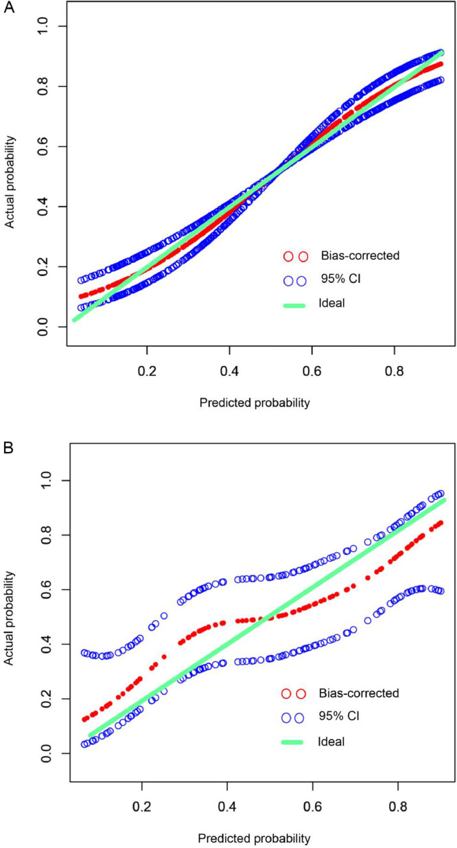
Fig. 2.
Calibration curve of the nomogram in development (a) and validation (b) cohorts. The x-axis represents the predicted EGFR mutation risk. The y-axis represents the actual EGFR mutation rate. The green line represents a perfect estimated mutation rate by an ideal model. The red circle represents the performance of the nomogram, in which a closer fit to the green line represents a better prediction. The blue circle represents the 95% confidence interval. EGFR, epidermal growth factor receptor.

