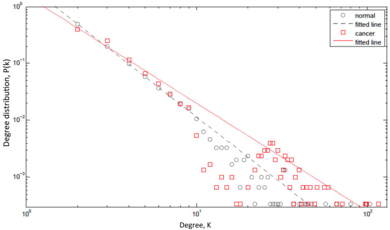
Figure 2.
Degree distribution plot. The figure shows the probability P(k) that a given protein interacts with k other proteins (the so-called degree distribution) on a log-log scale. The figure compares the degree distribution of a normal protein regulatory network (black circles) with that of a network impacted by cancer (red rectangles). A majority of the hubs in protein networks are IDPs and these IDPs have aberrant expression profiles in cancer and, moreover, they preferentially interact with other hubs. Consequently, the slope of the straight line fitted to the points for a cancer network (red solid line) is smaller than that for a normal network (black dashed line). Further, the maximum degree increases in a cancer network (the red rectangles extend further to the right as compared to the black circles). All simulations were carried out using Matlab (MATLAB version 7.12.: The MathWorks Inc., 2011). Adopted from [1].

