
Figure 1.
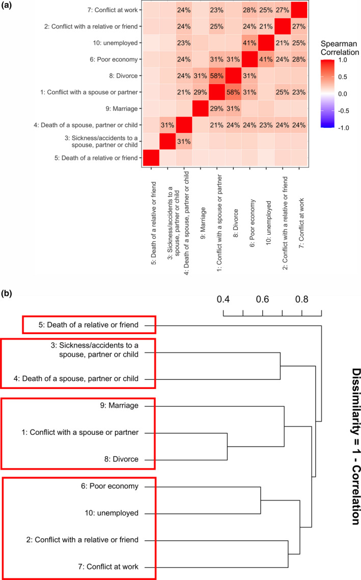
The correlation and dissimilarity structure amongst 10 life events. (a) Correlation matrix of the 10 life events. Spearman’s rank correlation coefficients for each event with all other events were calculated and these pairwise coefficients were mapped into a heat map. The color of each checker represents the magnitude of correlation. A darker color represents stronger correlation. (b) Dissimilarity structure of the 10 life events. Agglomerative hierarchical cluster analysis was performed (using complete linkage) to identify subgroups of the 10 life events. The y‐axis represents the dissimilarity (1 – correlation)