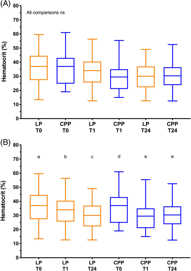
FIGURE 5.

Box and whisker plots of hematocrit (Hct) in the 2 arms of the trial. The middle lines represent the median change, the boxes represent the 25% and 75% percentiles of the change and the whiskers represent the minimum and maximum changes in the variables. A, Comparisons of hematocrit values between groups at each of the time points baseline (T0), 1 hour after the transfusion (T1) and 24 hours after the transfusion (T24). There were no significant differences between the 2 groups at any of the time points (Kruskal‐Wallis test). B, Comparisons of hematocrit values in each group over time. Plots sharing a letter code were not significantly different from each other. Plots not sharing a letter code were significantly different from each other P < .05 after correction for multiple comparisons (Friedman test). LP represents the lyophilized platelet group; CPP represents the cryopreserved platelet group
