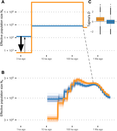
Fig. 3. Population genomic statistics and models of demographic history.

Orange represents Magnetic Island and blue represents northern populations in all component figures. Dashed line connects the point of divergence between populations. (A) Changes in effective population size and estimated gene flow for the best-fitting dadi model. Relative gene flow is shown using arrows with larger flow from north to south indicated by arrow size. (B) Changes in effective population size estimated using MSMC from high coverage (~20×) sequencing of a single colony from Magnetic Island (MI) and a colony from Fitzroy Island (FI). (C) (inset top right) Genome wide estimates of Tajima’s D calculated using PCAngsd. The scales for both time and Ne are dependent on values of the mutation rate (μ = 1.86 × 10⁻⁸ per bp per generation; see Methods) and generation time (5 years). Changes in these estimates would lead to a rescaling of axes but not the overall shape of demographic profiles.
