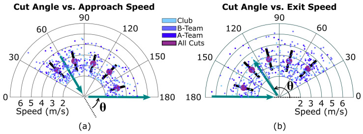
Figure 4.
Distribution of approach (a) and exit (b) speeds for different cut angle ranges (in degrees). The large purple dot shows the average speed for each cut angle range, while the black line shows standard deviation. Speeds from the three teams are shown in different colors, and an example path of a player through a cut is shown in green arrows. The polar axes are restricted to better show trends; 4 outlier speeds are outside this view.

