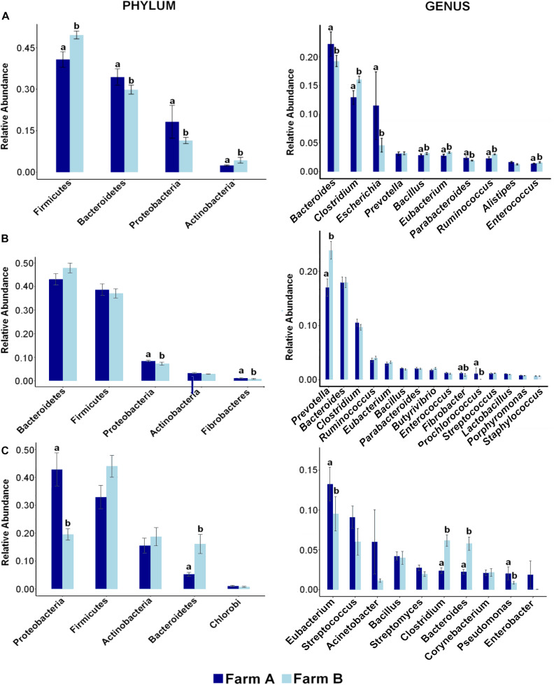
FIGURE 3.
Distribution of most abundant phyla and genera reveals differences across farms in each site. Bar plots showing the relative abundance of most abundant phyla (left) and genera (right) and differences between farm A (dark blue) and farm B (light blue) in (A) fecal swab, (B) rumen fluid, and (C) deep nasopharyngeal swab of dairy cattle. Pairwise comparisons were made between farms with Wilcox Sum test and different letters denote differences between farms (P < 0.05) within each taxa.

