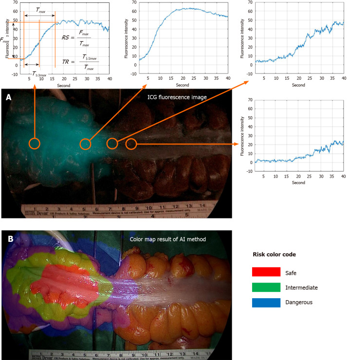
Figure 3.
Risk color map result of artificial intelligence based real-time analysis microperfusion on the indocyanine green video. A: Indocyanine green (ICG) fluorescence image and ICG curve graph at each position. Fmax is the amount of change in ICG fluorescence intensity. Tmax is the time it takes for the ICG fluorescence intensity change to become Fmax, T1/2max is the time it takes for the ICG fluorescence intensity change to become Fmax/2. Rising slope represents Fmax/Tmax. TR represents T1/2max/Tmax; B: Risk color map result of artificial intelligence method. Red region means risk-safe, green region means risk-intermediate, and blue region means risk-dangerous. TR: Time ratio; RS: Rising slope; ICG: Indocyanine green; AI: Artificial intelligence.

