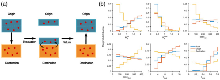
Figure 1.

Results from the two‐county model showing that origin and destination transmission rates have the greatest influence on final case numbers. (a) A schematic diagram for the two‐county model. Blue and orange boxes represent the origin and destination populations. Red dots within boxes represent infected individuals. (b) The marginal distribution of six parameters for the top 10% of combinations that lead to the lowest percentage increase (or highest percentage reduction) of reported cases in the origin county (solid red lines), the destination county (solid orange lines), and both counties combined (solid blue lines). Here and represent the transmission rates in the origin and destination; caseori and casedest represent the daily cases in the origin and destination; Teva is the duration of evacuation; and peva is the fraction of the origin population evacuating. The step changes in (b) are due to the discrete values used in model simulations.
