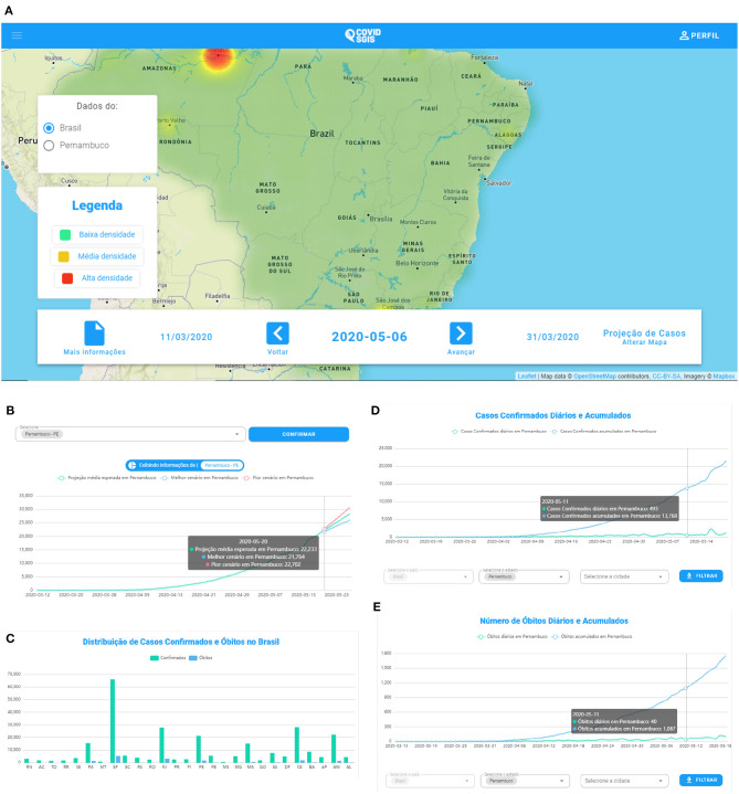
Figure 7.
(A) COVID SGIS web application home screen. (B) Accumulated cases of Covid-19 forecast graph. The forecast with ARIMA is represented by the green line. The worst case scenario (indicated by the upper limit of the forecast) is represented by the line in red. The best scenario (indicated by the lower limit of the forecast) is represented by the blue line. (C) Screen of the graph of the distribution of confirmed cases and deaths by Covid-19. In this graph the user can have an overview of the accumulated confirmed cases and death cases in all states of Brazil and the Distrito Federal. In COVID SGIS, the user can follow the daily and accumulated confirmed cases (D) and deaths (E) of Covid-19 for each Brazilian state and the Distrito Federal, separately.

