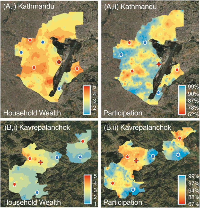
Figure 6.
Maps of Kathmandu (top) and Kavrepalanchok (bottom) catchment areas showing average household wealth index (quintile, with 5 the wealthiest) (top and bottom left) and survey participation rate (top and bottom right). Areas with higher wealth indices were correlated with lower survey participation rates (red asterisks), and areas with lower household wealth indices with higher survey response rates (blue asterisks). Red crosses note location of study facility.

