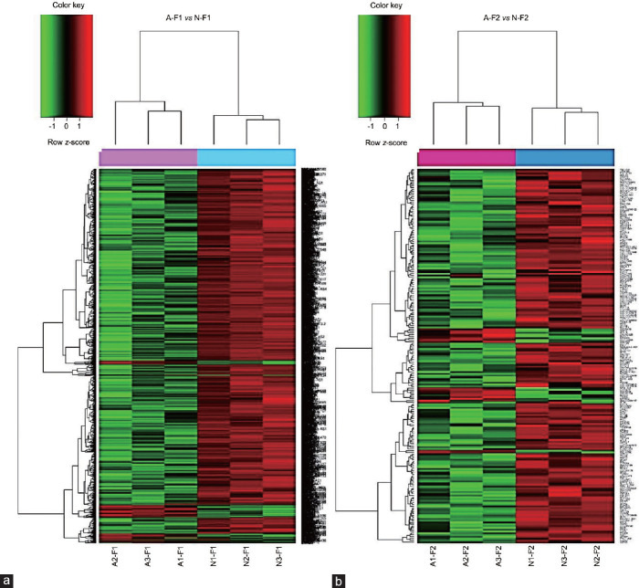
Figure 1.
Gene clustering of the microarray data showing pair-wise comparisons. (a) A–F1 versus N–F1; (b) A–F2 versus N–F2. Heatmaps show one sample for each column and one gene for each horizontal line. Color indicates gene expression value intensities (z-score), where red signifies upregulation, green downregulation, and black unchanged. A–F1: asthenozoospermic sperm subpopulation with high motility; N–F1: normozoospermic sperm subpopulation with high motility; A-F2: asthenozoospermic sperm subpopulation with low motility; N-F2: normozoospermic sperm subpopulation with low motility.

