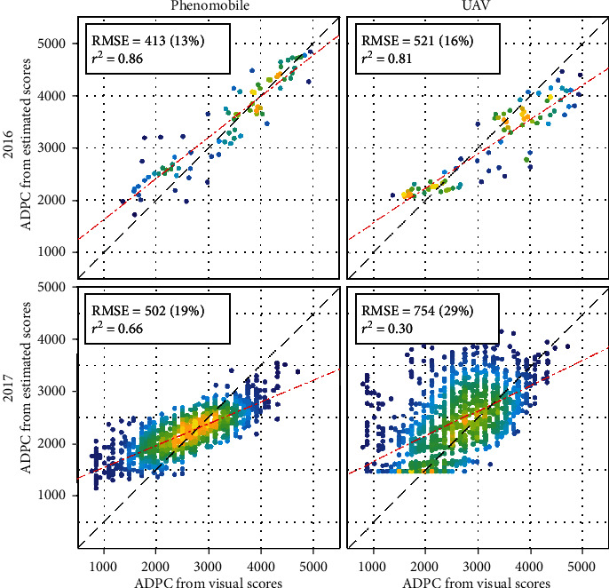
Figure 10.

ADPC computed from Phenomobile- (left) and UAV-derived (right) scores (see estimates in Figure 9) versus ADPC computed from visual CLS scores, for 2016 (top) and 2017 (bottom). Absolute and relative RMSE, squared Pearson's correlation coefficient, and linear fit are shown. The color indicates the point density, ranging from blue for low density to yellow for high density.
