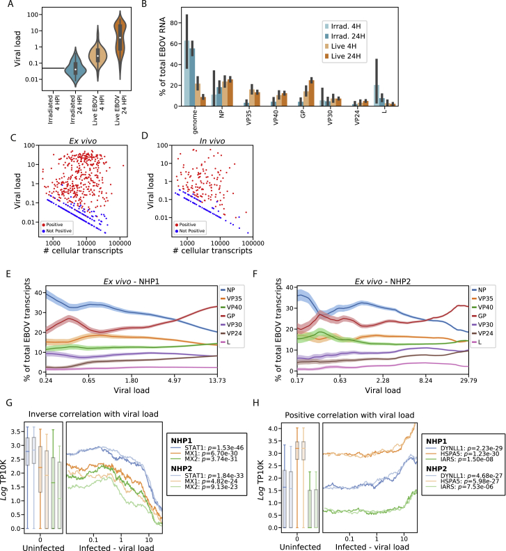
Figure S8.
EBOV Infection Dynamics in the Ex Vivo Dataset, Related to Figures 6 and 7
(A) Distributions of viral loads across monocytes from different treatment conditions. Central white marker: median; black bar: interquartile range.
(B) Estimated percentage of EBOV transcripts derived from the EBOV genome or each EBOV gene, out of total viral RNA, stratified by treatment conditions. Prior to averaging, the counts of EBOV genes for each cell was normalized to sum to one, so each cell contributes uniformly to the proportion, regardless of its total number of EBOV transcripts. Error bars: 95% bootstrap CI on the mean.
(C and D) Scatterplot of total transcripts (unique molecular identifiers) detected in a cell (x axis, log10 scale) against viral load (y axis, log10 scale) for cells with one or more viral reads ex vivo (C) or in vivo (D). Cells called as infected are colored in red and otherwise colored in blue.
(E and F) Relative proportion of each EBOV gene versus viral load (log10 scale) ex vivo for cells from donor NHP1 (E) or NHP2 (F). We ordered monocytes by viral load and averaged the percentage of each viral gene over 50-cell sliding windows. Color bands: mean ± 1 SD.
(G and H) Association between gene expression and viral load for selected negatively (G) and positively (G) associated host genes in monocytes, 24 HPI after inoculation with live virus ex vivo. In the left sub-plots, distributions of gene expression in uninfected bystander cells are shown as a boxplot, boxes: interquartile range, whiskers: 2.5th and 97.5th percentiles. In the right sub-plots, we ordered infected cells by viral load (log10 scale) and averaged gene expression (loge TP10K) over 100-cell sliding windows. Curves and box-plots are shown separately for the 2 donor NHPs. p-values for the Spearman correlation between viral load and gene expression are listed for each NHP donor in the legend.

