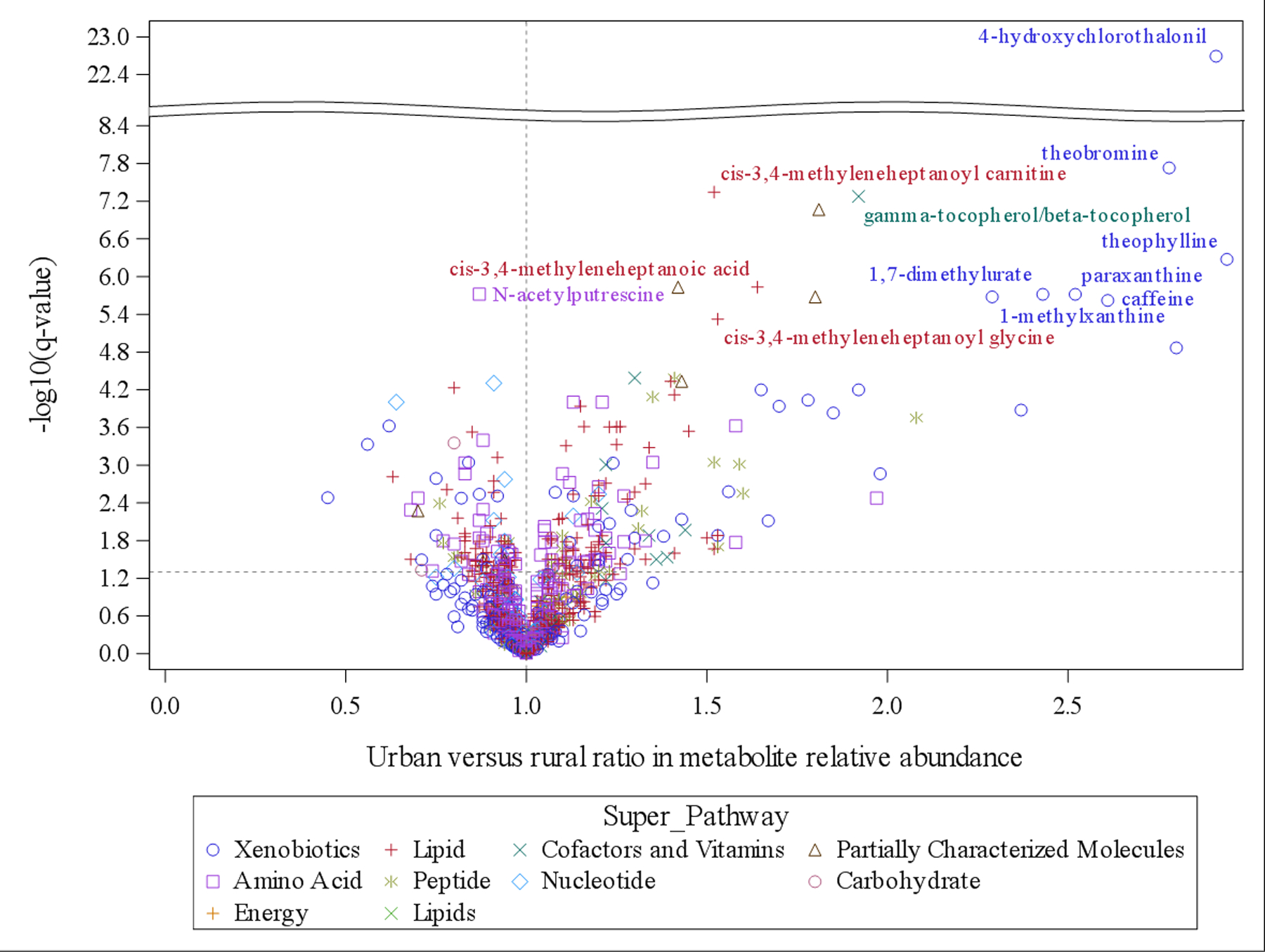
Fig 2. Volcano plot for the association between urbanization and individual metabolites.

X axis is the urban versus rural ratio of metabolites relative abundance and y axis is the -log10(q-value) based on linear regression adjusting for age, sex, and province. Metabolites types (super-pathway) are indicated by different colors and shapes. Metabolites with q-value<1.0E-05 are labeled (excluding three partially characterized metabolites).
