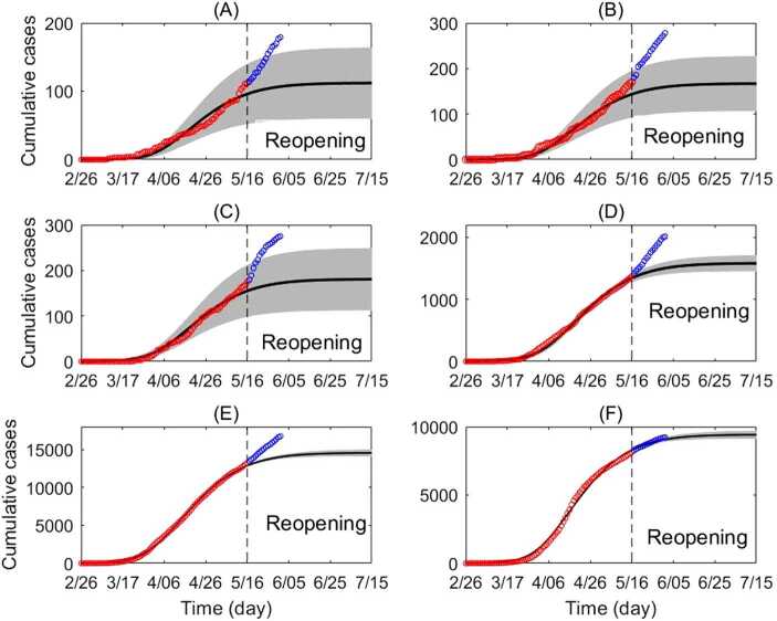
Figure 3.
Cumulative incidence according to age class. Cumulative incidence according to age class (circles) and best fitting transmission model (line), with 95% confidence interval (gray region). The red circles represent data from February 26 to May 16 (fitted). The blue circles represent data May 17 to June 1 (not fitted). Cumulative incidence shown for (A) ages 0–5, (B) ages 6–13, (C) ages 14–17, (D) ages 18–24, (E) ages 25–64 and (F) ages 65+. For an explanation of the increase in reported cases after May 16, see Appendix B: Caution in interpretation

