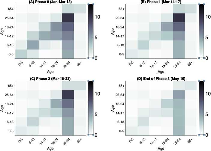
Figure 5.
Age-specific contact mixing pattern estimated for each escalation phase. Shown are the heatmaps of contact matrices for all settings (workplace, school, community, and household) combined. The intensity of the color of an entry corresponds to the magnitude of the contact rate between the intersecting age classes. The row of the matrix represents the contactor age class and the column represents the age class of the contactee. Heatmaps depicted for contact mixing in (A) phase 0, (B) phase 1, (C) phase 2 and (D) the end of phase 3 on May 16

