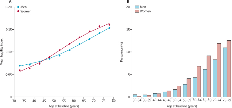
Figure 1.
Mean frailty index and frailty prevalence by age and sex
(A) The datapoints represents the mean value of the frailty index per each 5-year age group and the lines represents the fitted curve of the frailty index. (B) The histogram represents the prevalence of frailty per each 5-year age group.

