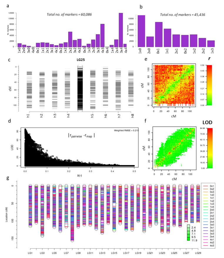
Figure 2.
Linkage map construction in a tetraploid A. chinensis F1 population. (a) is the plot of the number of markers in each of 24 Single Nucleotide Polymorphism (SNP) marker classes in the population; (b) number of SNP markers after re-coding marker types and filtering for quality; (c) shows the fully phased and integrated map of Linkage Group (LG)25 (center), with markers on each homologue of P1 (h1–h4) and P2 (h5–h8) to left and right, respectively; (d) plot of the difference between pairwise estimates of recombination frequency and the multi-point estimate of the recombination frequency on the LG25 map plotted against the logarithm of the odds (LOD) score associated with that estimate; (e) comparative view of the position of markers on the map and recombination frequency estimates to other markers, with lower to higher recombination frequency (r) on a scale of green to red, respectively; (f) plot similar to e) showing the LOD values for the markers with a scale of lower to higher LOD from green to red respectively; (g) integrated linkage maps of all the 29 linkage groups with the different classes of markers highlighted in different colors. The degree of stress on a particular location on a linkage map is shown by minor green bars adjacent to the position on each linkage group and the quantitative value of the stress is indicated in the figure.

