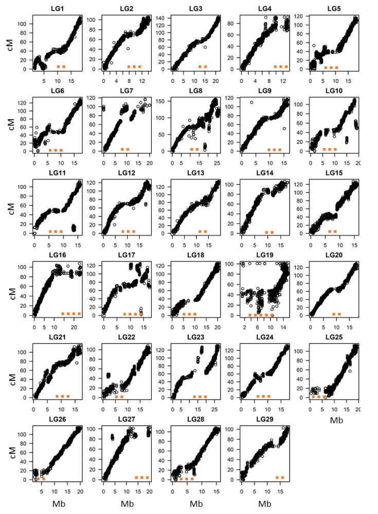
Figure 4.
Marey plots for individual linkage groups of tetraploid A. chinensis. The figure represents a graphical overview of the genetic map (cM) position on the y-axis when plotted versus the physical map position (Mb) on the x-axis, using the positional information of each marker. The orange dots represent regions where the genetic map is not linear with the physical map, indicating potential regions of reduced recombination frequency (putative regions of pericentromeric heterochromatin).

