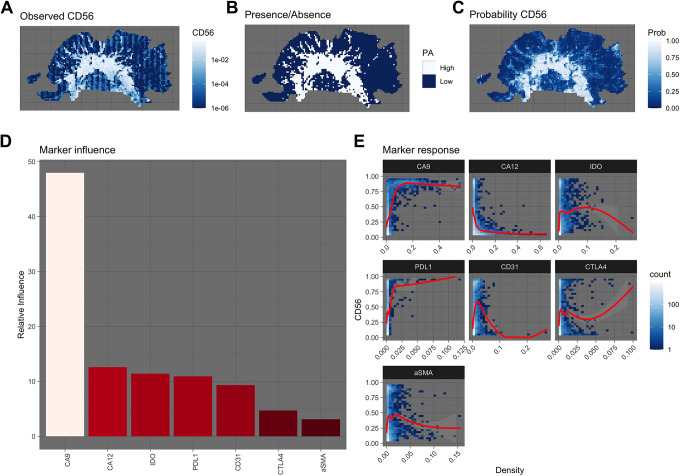
Figure 2.
A Observed density of CD56. B Presence/absence map indicating high and low regions of CD56. C The trained SDM’s predicted probabilities of CD56 high regions. D The overall influence each marker has on the SDM’s ability to predict the location of CD56 high regions. E Response plot, showing how each marker influences the probability of there being a CD56 high region. Blues indicate the density of points, while the red line shows the trend line fit using a generalize additive model.

