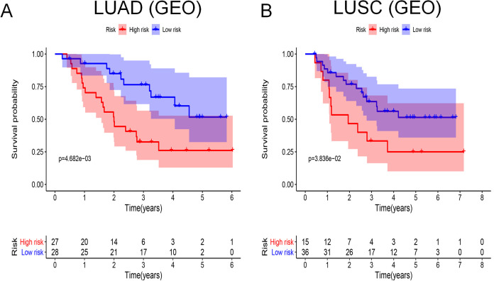
Figure 8.
Survival curves analysis based on GEO database. At the bottom of survival curves, 2 lines of figures represent the number of survivors in high- and low-risk groups, which decreases gradually with follow-up time. (A) Survival curve for LUAD based on GEO database; (B) Survival curve for LUSC based on GEO database.

