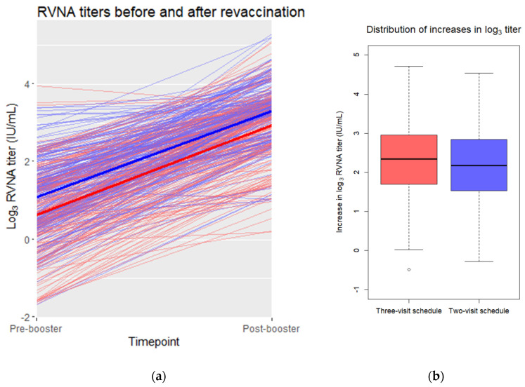
Figure 2.
(a) Pre- and post-booster log3 RVNA titers in a scatterplot. Individual pre- and post-booster values are connected by thin red (three-visit schedule) or blue (two-visit schedule) lines. The mean values of the three-visit schedule are connected with a thick red line. The mean values of the two-visit schedule are connected with a thick blue line. (b) Distribution of the pre- and post-booster differences in log3 titer for each vaccination schedule. Depicted are the medians per schedule (horizontal line in the box) and the 25th and 75th percentile (upper and lower bound of the box). The whiskers represent the value in the data nearest to up to 1.5 times the interquartile range. One outlier, depicted as an open dot, falls outside of this range.

